To continue a recent string of theme related posts, I'm going to add another on the recently added feature allowing addition of advanced input controls and behaviors to theme settings.
Themes are the whip cream that bring flavour and sweetness to our portal fruit salads. Without beautiful and clever theme designs our fruit salad may taste healthy but can be bland and leave us wanting other treats.
To make sure this doesn't happen, Liferay tries its hardest, each generation, to bring new and/or improved features and richness to the theme APIs in order to empower designers to create master pieces.
One of the tools in the deisgners chest which was added in 6.0 and which added pretty significant flexibility to theme developers was the Settings API.
As the name implies, the Settings API is a mechanism that allows a designer to add configuration settings to their theme creations. These settings can then be used within the theme logic to do things like toggle features on or off, provide lists of options for display behaviors, provide boiler plate content fragments, etc. Using this API the designer can, with a single theme, attempt to provide a mixture of options that can potentially meet many more requirements and appeal to more users.
Using the Settings API
In order to use the settings API the designer must include a liferay-look-and-feel.xml file in their theme. The path should be:
<theme>/docroot/WEB-INF/liferay-look-and-feel.xml
As you might have guessed this is an xml file and a boiler plate file for 6.1 could be as trim as the following:
<?xml version="1.0"?>
 <!DOCTYPE
    look-and-feel PUBLIC
    "-//Liferay//DTD Look and Feel 6.1.0//EN"
    "http://www.liferay.com/dtd/liferay-look-and-feel_6_1_0.dtd">

<look-and-feel>
    <compatibility>
        <version>6.1.0+</version>
    </compatibility>
    <theme id="hotel" name="Hotel Theme" />
</look-and-feel>
Plainly enough this file defines the compatibility the theme has with different portal versions (in this case, since we're using features from 6.1 DTD, we're limiting our compatibility to 6.1+). It defines the theme element which contains the id of the theme as well as the name that will appear in the UI during theme selection/configuration.
In order to add settings we're going to add an element as a child of the <theme> element:
<?xml version="1.0"?>
 <!DOCTYPE
    look-and-feel PUBLIC
    "-//Liferay//DTD Look and Feel 6.1.0//EN"
    "http://www.liferay.com/dtd/liferay-look-and-feel_6_1_0.dtd">

<look-and-feel>
    <compatibility>
        <version>6.1.0+</version>
    </compatibility>
    <theme id="hotel" name="Hotel Theme" >
        <settings>
        </settings>
    </theme>
</look-and-feel>
Each setting is defined using a single <setting> elements with two main attributes, key (the name by which the setting is handled) and value (in the case of configurable setting, this will be the default value).
e.g.
...
<settings>
   <setting key="show-breadcrumb" value="true" />
</settings>
...
There are three optional attributes (added in 6.1):
- configurable (whether or not the setting is static or editable from the UI)
- type (the data type for the field: checkbox, select, text, or textarea, default is text if not provided)
- options (in the case of type="select", options should contain a comma delimited list of values available to the selection)
Therefore a slightly more advanced setting might be:
...
<settings>
    <setting configurable="true" key="show-breadcrumb" type="checkbox" value="true" />
 </settings>
...
So, how would this be used from the theme?
The usage is pretty simple and is handled by a single method on the ThemeDisplay object; getThemeSetting(String key). The ThemeDisplay object you say? Do not fear, this object is already in the context of both Velocity and Freemarker. In Velocity it is available as both $themeDisplay, as well as $theme_display. In Freemaker it's available as themeDisplay as well as theme_display.
Using the setting we created above, in your theme's portal_normal.vm (in a Velocity theme) you might do the following:
#set ($show_breadcrumb = $theme_display.getThemeSetting('show-breadcrumb'))

#if ($show_breadcrumb == 'true')
    <nav class="site-breadcrumbs" id="breadcrumbs">
        <h1>
            <span>#language("breadcrumbs")</span>
        </h1>
        #breadcrumbs()
    </nav>
#end
Checkbox type fields have string values of either "true" or "false".
Advanced controls
So far I have not talked about the Advanced Controls I referred to in the title of the post.
So you have controls, fine! Checkboxs, text fields, textareas, and selects are great but we can't exactly call this a great collection of "rich" controls. These are the lowest common controls that you'd probably expect. We're talking about theme developement here, so we want some POP and PIZZAZ (yes PIZZAZ!!!).
To solve this limitation without trying to provide for every scenario imaginable we added the ability for a setting definition to contain a block of javascript code which would be inlined immediately with the input field. This javascript would allow the designer to take the basic field types and turn them into a more advanced control.
For the following example I'm going to bind a color picker tool to a regular text field.
First the base xml for the definition:
...
<setting
    configurable="true"
    key="portal-main-color"
    type="text"
    value="#EEF0F2">
<![CDATA[
]]>
</setting>
...
Now, I'm going to use the Alloy UI color-picker component and some other simple code for making the field read-only so users can't input faulty data:
...
<setting
    configurable="true"
    key="portal-main-color"
    type="text"
    value="#EEF0F2">
<![CDATA[
</setting> ...
If you read through the javascript you will see that we get an element using the A.one() alloy call. This is akin to document.getElementById() but it works by using css selectors. In this case we're getting the setting field by using the key of the field prefixed by the # symbol, which in CSS means that it's the ID of an element. The key is also prefixed by the token [@NAMESPACE@]. This token is used to avoid namespace collisions with other applications that may be floating around the page and is replaced at runtime with the actual namespace of the theme configuration app (in a portal we always need to be conscious that we may be co-existing with other apps). Use the token whenever creating public variables or dom objects.
Once we have the field, we can manipulate it however we like.
The Advanced Control Result
We've added the control, so what does it look like?
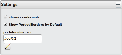
Here is the settings panel with the new field and the control:

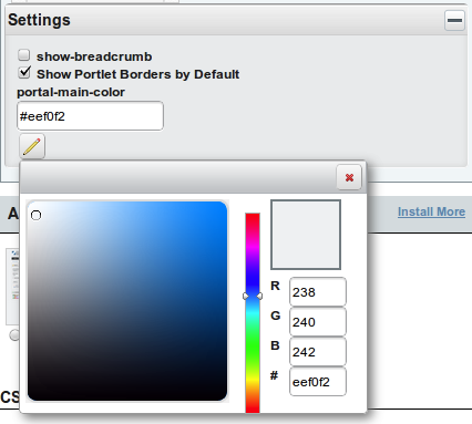
With the control active:

Moving the cursor around the color-picker while left button pressing on the mouse will move the color-picker cursor and update the value in the setting text field until you release the button.
The Possibilities
Given the multitude of advanced controls we can create using javascript and the simple usage of the Settings API, the possibilities are quite limitless.
I hope that this takes your theme development to a whole new level of creativity and richness.
I'll be at WCS doing a couple of talks and a workshop which I'll be talking about shortly. So if you have questions regarding any of the things I've writen about recently, or about any other topic actually, and you're attending WCS, please bring those along with you.
See you at WCS!
Update: I wanted to add that the Theme Settings feature was originally implemented and donated to Liferay as part of a community contribution by José Ignacio Huertas (LPS-12468). I'd like to thank José for his contribution. This is a very good example of how a small contribution by the community can become a very cool feature. I would like to encourage others to participate by donating their feature implementations, suggestions, bug reports, documentation skills, or translation skills. This is the key way that Liferay has become the rich platform that it is.


